
Data analysis relies heavily on the capacity to convey information convincingly and easily. The waterfall chart stands out as a powerful tool for depicting the sequential changes in data. Learning to make waterfall charts is a great way to improve your data visualisation abilities, whether you’re an expert data analyst or just starting and want to take a Microsoft Excel Online Course.
In this blog, we’ll explore the details of making a Waterfall Chart in Excel, providing a thorough tutorial to make your data more engaging.


Table of Contents
- Understanding the Waterfall Chart Concept
- Launching Microsoft Excel
- Organising Your Data
- Inserting the Initial Stages
- Navigating Negative Changes
- Fine-Tuning Your Waterfall Chart
- Styling Your Waterfall Chart
- Keeping Your Chart Current
- Conclusion
Understanding the Waterfall Chart Concept
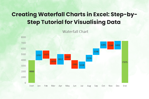
A sophisticated comprehension of the data at hand is necessary to create compelling visualisations. The waterfall chart, so called because of the way it cascades, is excellent at showing how different changes, both positive and negative, impact the beginning numbers. Like a cascade, these adjustments let viewers see how one variable affects the whole. It is important to understand the value of a waterfall chart in simplifying complicated data stories before we get into the specifics of creating one in Excel.
Launching Microsoft Excel
The first step in creating a waterfall chart is to launch Microsoft Excel. If you haven’t already, taking an online course in Microsoft Excel can be a great idea. You must be familiar with the software’s fundamental features to get through the subsequent phases without a hitch. Once Excel is operational, you can turn raw data into an aesthetically appealing story.
Organising Your Data
Careful data organisation is critical to creating a successful waterfall graphic. Make sure all of your information is neatly organised before proceeding. A waterfall chart usually calls for a list of categories or periods of time along with their associated values. Beginning with the starting value, the graph shows the progression of positive and negative values, ending with the final value. Remember that a robust waterfall chart relies on an easily understandable data structure.
Inserting the Initial Stages
After you have all of your data in order, you may begin to input the first phases of your waterfall chart, which will show positive improvements. These may be improvements in income, earnings, or any other indicator you choose to emphasise. Go to the “Insert” tab in Excel and choose the cells that match these improvements. Select “Waterfall Chart” from the menu to begin making your visualisation’s escalating stages.
Navigating Negative Changes
The absence of acknowledgement of difficulties renders any data narrative incomplete. Negative changes, as seen by the falling steps in your waterfall chart, represent declines in values. Make sure these negative modifications match up with your data structure and then select the cells that correspond to them. Select the ‘Waterfall Chart’ from the ‘Insert’ menu to add the descending steps, just as you did with the positive adjustments.
Fine-Tuning Your Waterfall Chart
After laying the groundwork for your waterfall chart, the next step is to fine-tune the specifics. Excel offers various formatting choices to help you make your chart stand out and make it easier to understand. To put each step into context, you may change the colours, add labels, and use data labels. Your waterfall chart should progress from a list of steps to a unified storyboard that tells a compelling story.
Styling Your Waterfall Chart
Think about the visual appeal that will draw in viewers as you refine the arrangement of your waterfall chart. If you want your data narrative to stand out, use Excel’s many style choices to choose colours, patterns, and typefaces. Make strategic use of these formatting elements to ensure your waterfall chart is visually engaging and successfully delivers information. If you want your chart to go beyond being informational and make an effect, you must find the sweet spot between design and content.
Keeping Your Chart Current
A waterfall chart’s strength is in its flexibility to accommodate ever-changing datasets. Discover the easiest way to update your chart with new data as it becomes available. Maintaining a current waterfall chart guarantees that your audience gets the most relevant and up-to-date information, whether monthly financial reports or quarterly performance measurements. Excel makes incorporating new data into an existing chart easy without affecting its validity or effectiveness.
Conclusion
Knowing how to make Excel waterfall charts is a critical data analysis skill as we wrap off this detailed course. Your capacity to convey captivating data stories is enhanced at every stage, from grasping the idea to refining the specifics. To round up your knowledge and skills in data visualisation, consider taking an online course in Microsoft Excel. This will allow you to expand your analytical toolbox. Your data storytelling will be visually engaging and informative using waterfall charts. You’ll become a storyteller using the language of statistics.


